FEEDTHEWOLF
When I first discussed this new logo project with the client, I was a little anxious…
“What style do you like?”
“I don’t know…”
“Do you want to have an image or just use words for the logo?”
“I don’t know…”
“What color do you like?”
“Red! I really like red!”
Well, at least the color was decided (¬‿¬)
FEEDTHEWOLF doesn’t sell dog food. The name was inspired by the strength of wolves, and we’re all wolves in our own ways. One of the goals of the company is to teach people that food fuels our bodies, not something we should be ashamed to enjoy.
Initially, we wanted to avoid confusion that the company sells dog food by not having a wolf in the logo. We actually started playing with typography to convey strength. But then again… “wolf” is in the name… With this, these were some preliminary ideas.

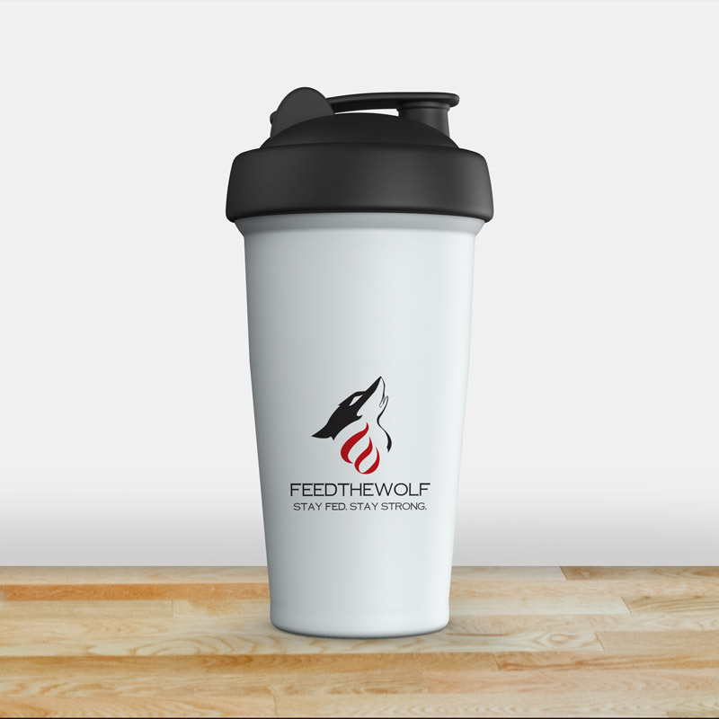
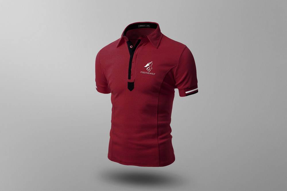
In the end, the chosen logo combined a wolf AND fire. If you look closely, the fire looks like a “W”, for wolf.


