the A
THE A was conceived from another company I worked with before called EVENTSTAGERS. (Yes, both company names are capitalized, I’m not doing it for fun.) EVENTSTAGERS provides event staffing, rental services, and anything you’d need for a successful and enjoyable event.
Our first collaboration was to redesign the logo, turning the green martini into a sleek and modern suit.
![]()
Since the collaboration was a success, we worked on the logo of her second business – THE A. This business focused on connecting event vendors to their ideal clients. (So more like networking, branding, and etc. type of events and services.)
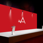
The goal was to keep it simple, versatile and strong! The owner has a vibrant, very outgoing, and down to earth personality. Since her personality and events are always very upbeat, it inspired me to use the “A” as a heartbeat!
She told me at the end that this design made her think of a server holding a tray! (Do you see it?)


